
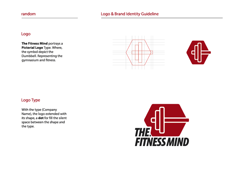
When THE FITNESS MIND approached me to create their logo and brand identity, I knew it was time to flex some creative muscles! This online shop is all about bringing class, quality, and style to gym accessories, so I designed a logo that’s as strong and sleek as their products.
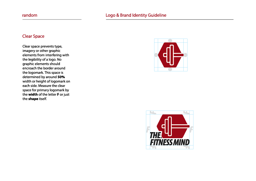
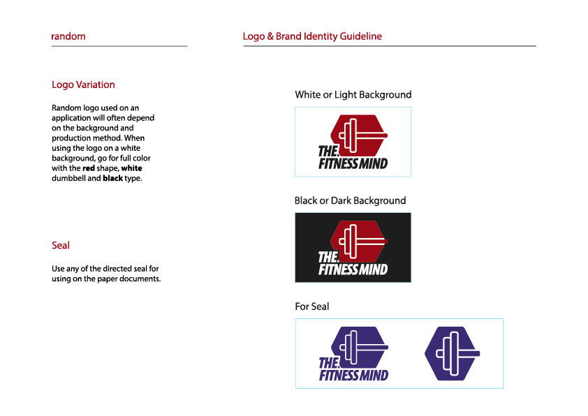
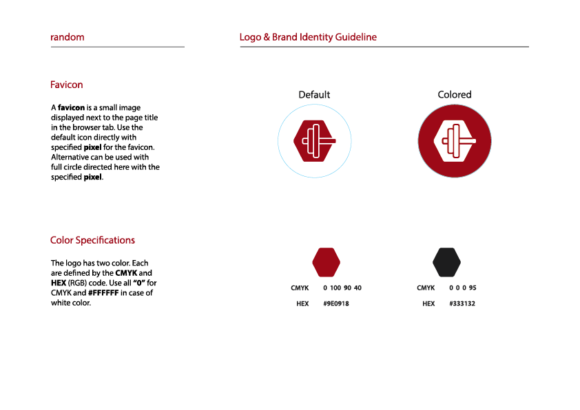
The logo combines bold typography with a dynamic icon that symbolizes growth, strength, and focus—perfect for a brand that helps fitness enthusiasts level up their game. I also crafted a full brand guideline to ensure consistency across all platforms, from their website to packaging. Think clean lines, vibrant colors, and a vibe that screams "get ready to crush your goals!"
It was a workout for my creativity, but the result? A brand identity that’s as fit and fabulous as their customers. Let’s just say, THE FITNESS MIND is now dressed to impress!

When I designed the logo for Reviewtic, Bangladesh’s first full-fledged review platform, I aimed to capture its mission of empowering SMEs and guiding consumers through trust and innovation. At its heart, a star represents the ratings customers can give, while a message icon reflects the feedback and reviews that drive transparency. A deep blue conveys trust and expertise, while a vibrant orange accent adds energy and growth, reflecting Reviewtic’s dynamic role in connecting businesses and consumers. The circular element surrounding the design represents unity and the continuous cycle of feedback, mirroring the platform’s commitment to progress.
This logo is more than just a visual identity—it’s a promise of excellence. The star and message icon together symbolize the core of Reviewtic’s purpose: enabling customers to share their experiences and rate businesses, while fostering a culture of trust and improvement. Years later, it stands as a timeless emblem of innovation, transparency, and the transformative impact Reviewtic has on Bangladesh’s business landscape. Every detail, from the colors to the symbols, was crafted to inspire confidence and growth, making it a fitting representation of a platform that bridges ambition and opportunity.

The Eco Sash logo merges simplicity with purpose. The clean, bold typography of "Eco Sash" reflects the company’s focus on precision and professionalism in crafting custom sash windows. Integrated subtly with the text is a fresh, organic leaf symbol—representing sustainability and the brand’s commitment to eco-friendly solutions. This minimalist design embodies their dual mission: offering tailored window designs for homes and offices while prioritizing environmental responsibility, making every frame a blend of elegance and Earth-conscious innovation.

P.S. I promise to respond faster like a caffeinated cheetah!